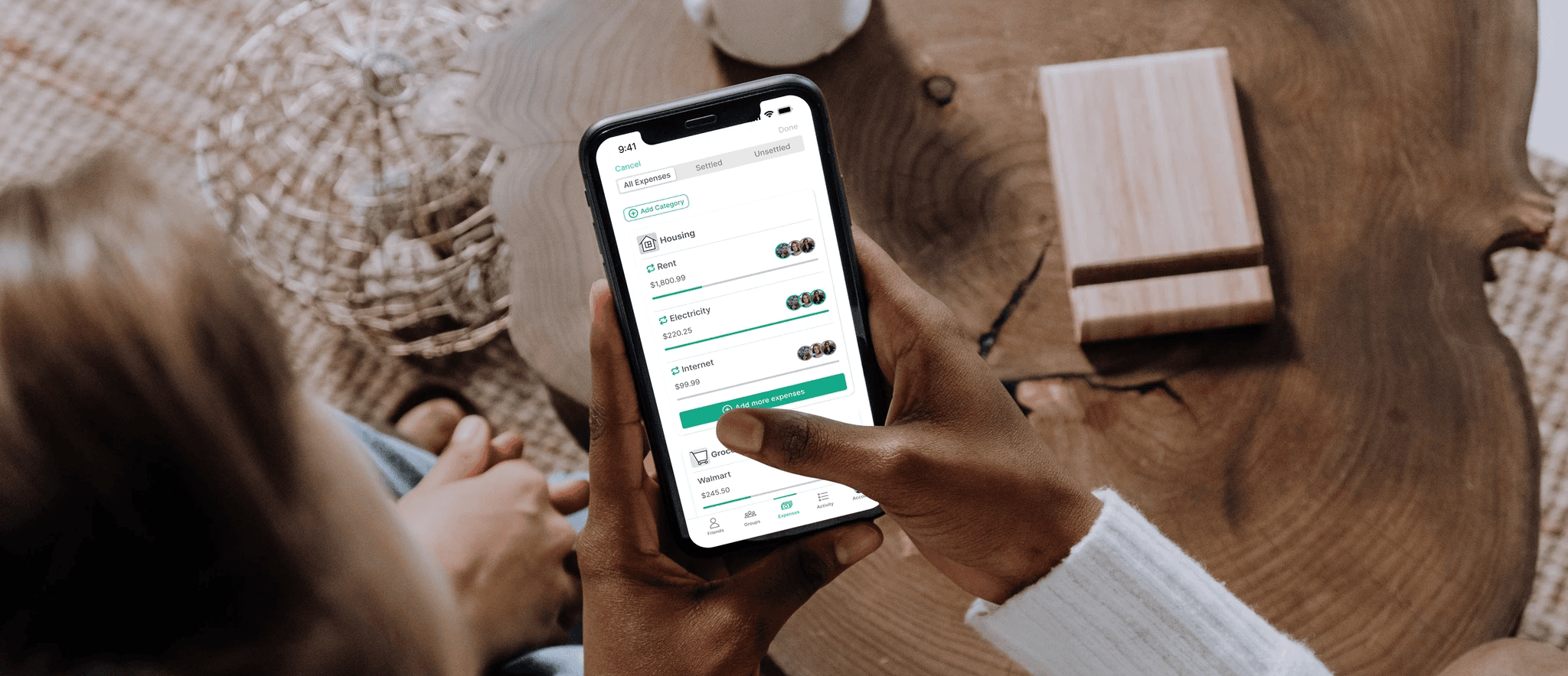
Helping Splitwise improve their expense tracking and payment splitting experience

This case study highlights the successful redesign of Splitwise's Add and Split Expenses flow, aiming to enhance the user experience by introducing intuitive and transparent features. By accurately reflecting payments and improving categorization, the solution fosters trust, accountability, and higher conversion rates, ultimately driving sustained business growth.

Role

User Research

Product Strategy

UI Design

Interaction Design

Usability Testing

Tools

Figjam

Notion

Maze

Figma

Dovetail

Google Forms

Timeline

10 weeks

The Problem

Young professionals living in group situations face challenges when tracking and splitting expenses in their daily lives. Through qualitative research, we have identified the importance of automation, transparency, and accountability in enhancing the expense management experience for this audience. Additionally, the business recognizes a need for introducing categorization and improving payment visualizations to foster trust and build stronger connections with the product.

The Solution

Our solution enhances the Splitwise experience for individuals living in shared arrangements by introducing pre-defined and custom expense categories, streamlining the categorization process. Additionally, we provide transparency by displaying individual payment amounts for each expense, and we use color-coded avatars to quickly identify users who have settled up for an expense versus those who have not, fostering trust and accountability among users.

Qualitative Research Survey

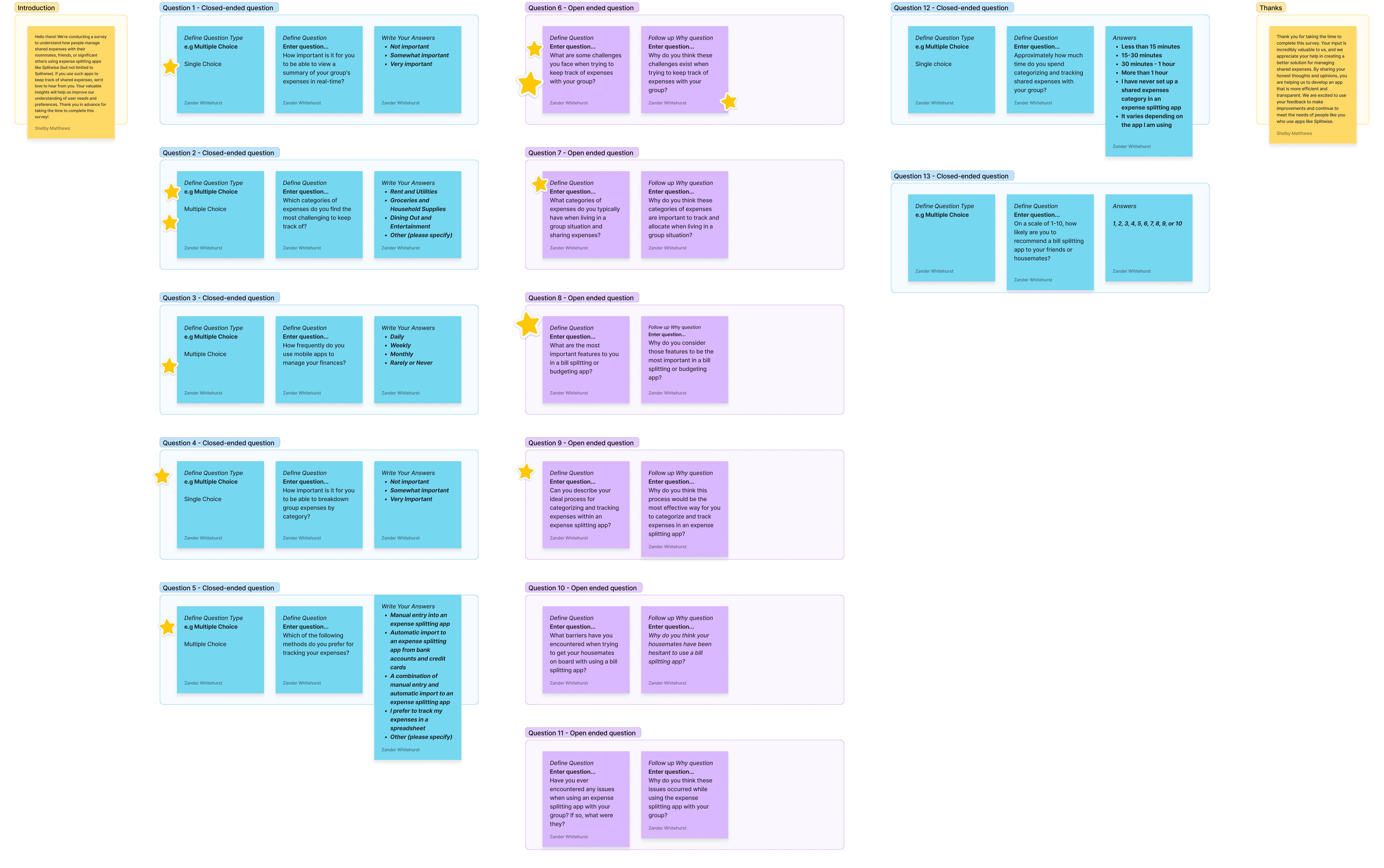
To understand user pain points, we conducted a qualitative research survey, gathering feedback from 15 participants. Through this survey, we identified common frustrations in the expense tracking and payment splitting process.

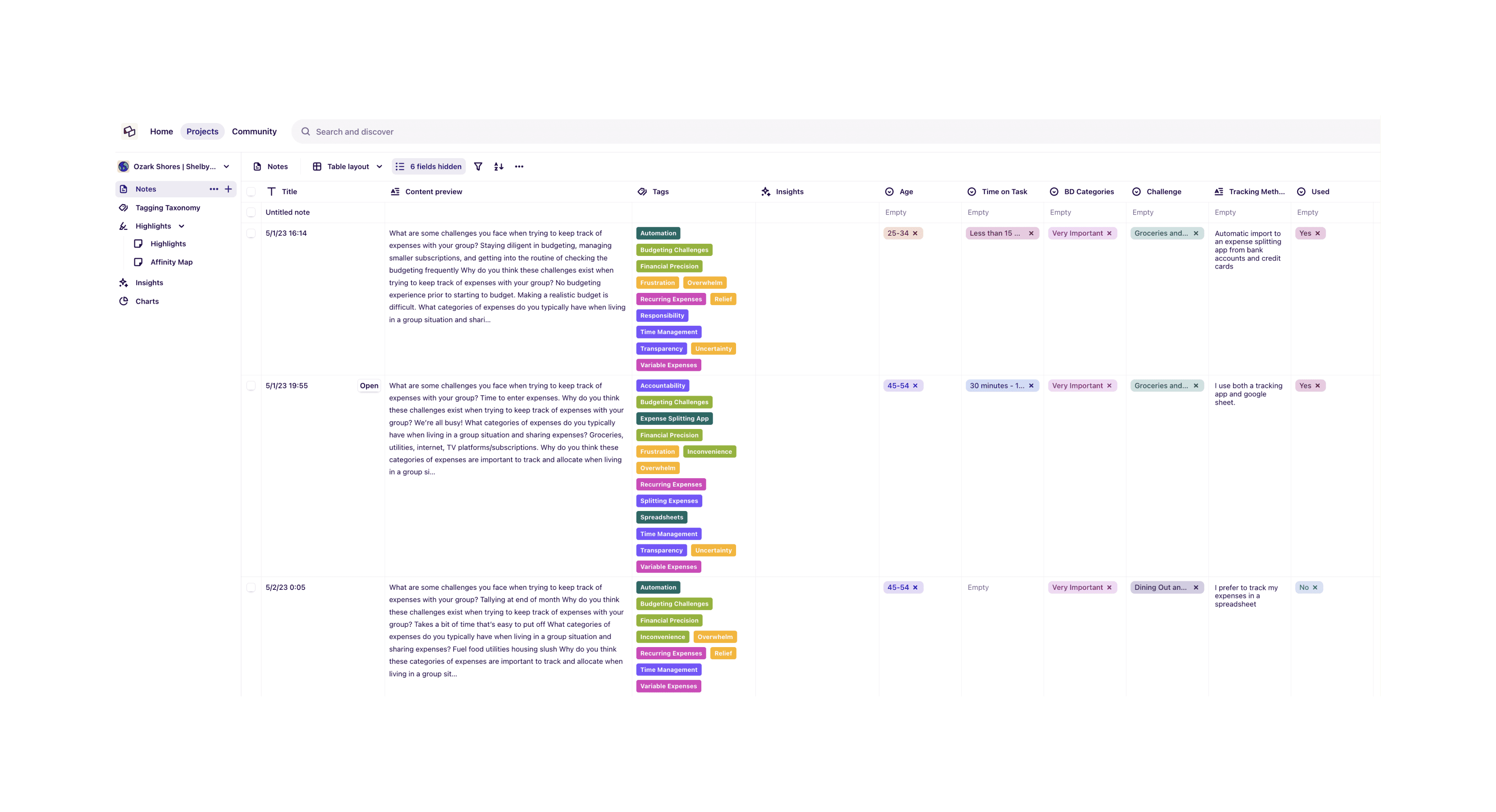
Synthesizing with Dovetail

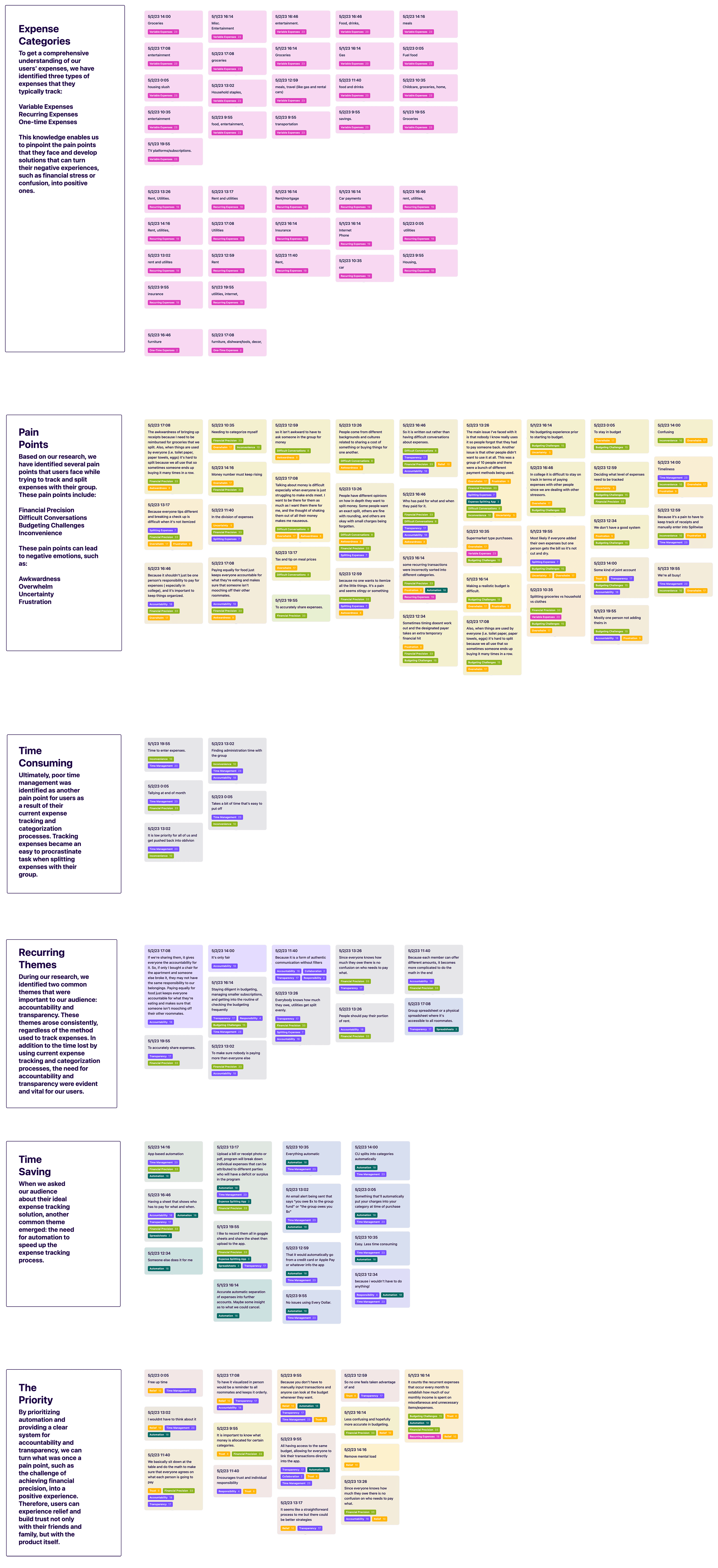
In the Dovetail synthesis process, we analyzed the qualitative survey results by creating a tagging taxonomy to organize data and identify common themes. Additionally, we constructed an affinity map to visualize patterns and connections among user feedback, guiding our solution effectively.

Business & User frustrations

By addressing user frustrations with a more streamlined and transparent solution, our approach aligns with the business's objective of improving user trust and retention. While the direct tie between user frustrations and business frustrations may not be based solely on the generative research data, our solution aims to address both aspects effectively, ultimately benefiting both users and the business.

User Frustrations

Through our qualitative research survey, users in shared living arrangements expressed frustration with their existing expense tracking and payment splitting processes. They found it time-consuming and cumbersome, leading to difficulties in accurately documenting shared expenses and settling up efficiently. Additionally, users encountered a lack of transparency, which impacted trust and accountability within their group.

Business Frustrations

Understanding the importance of user trust and retention for sustained business growth, the business identified a need to address the lack of transparency and accountability in their expense tracking process. The aim is to enhance the user experience, fostering trust with their product, and encouraging users to return to the platform consistently.

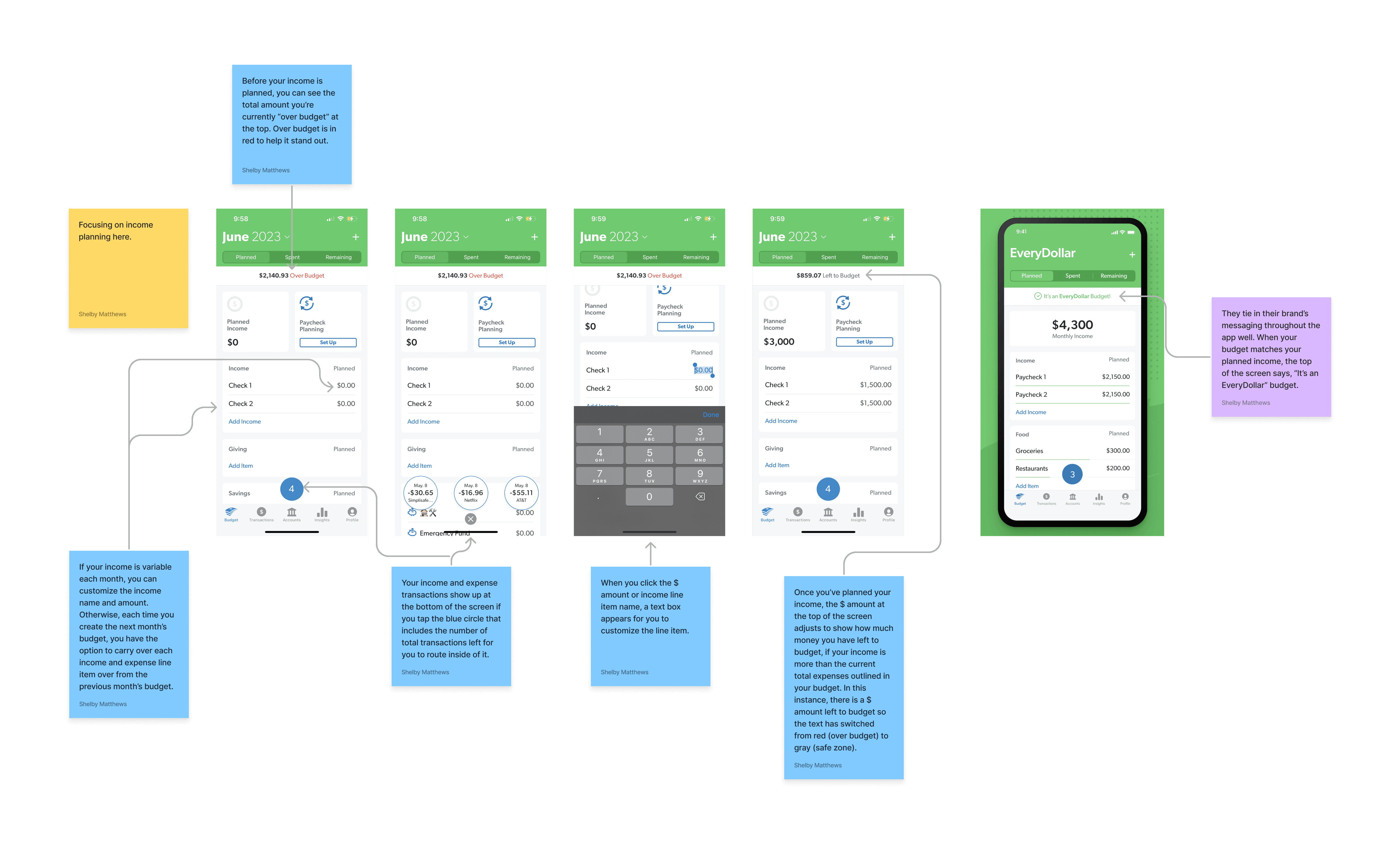
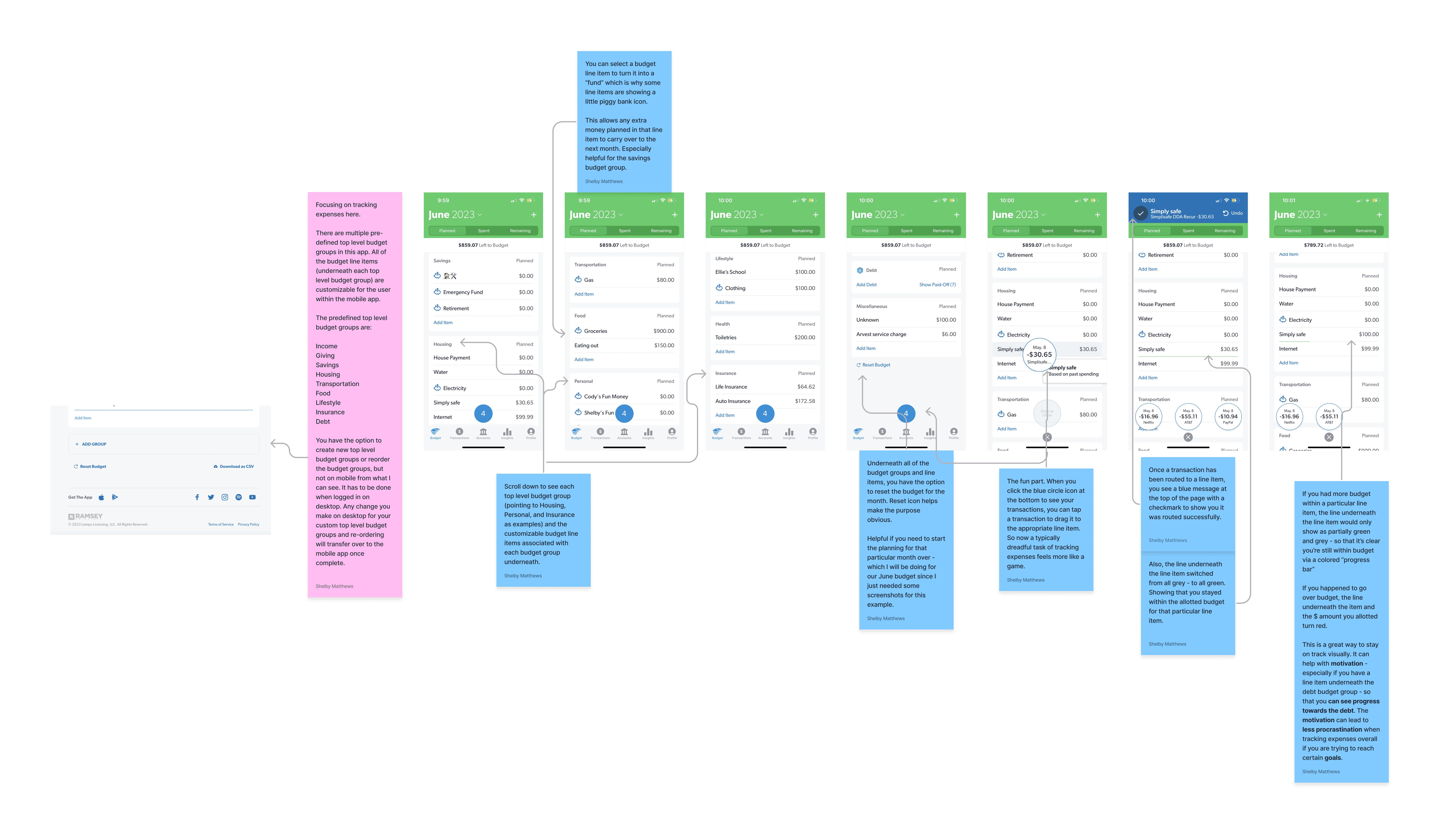
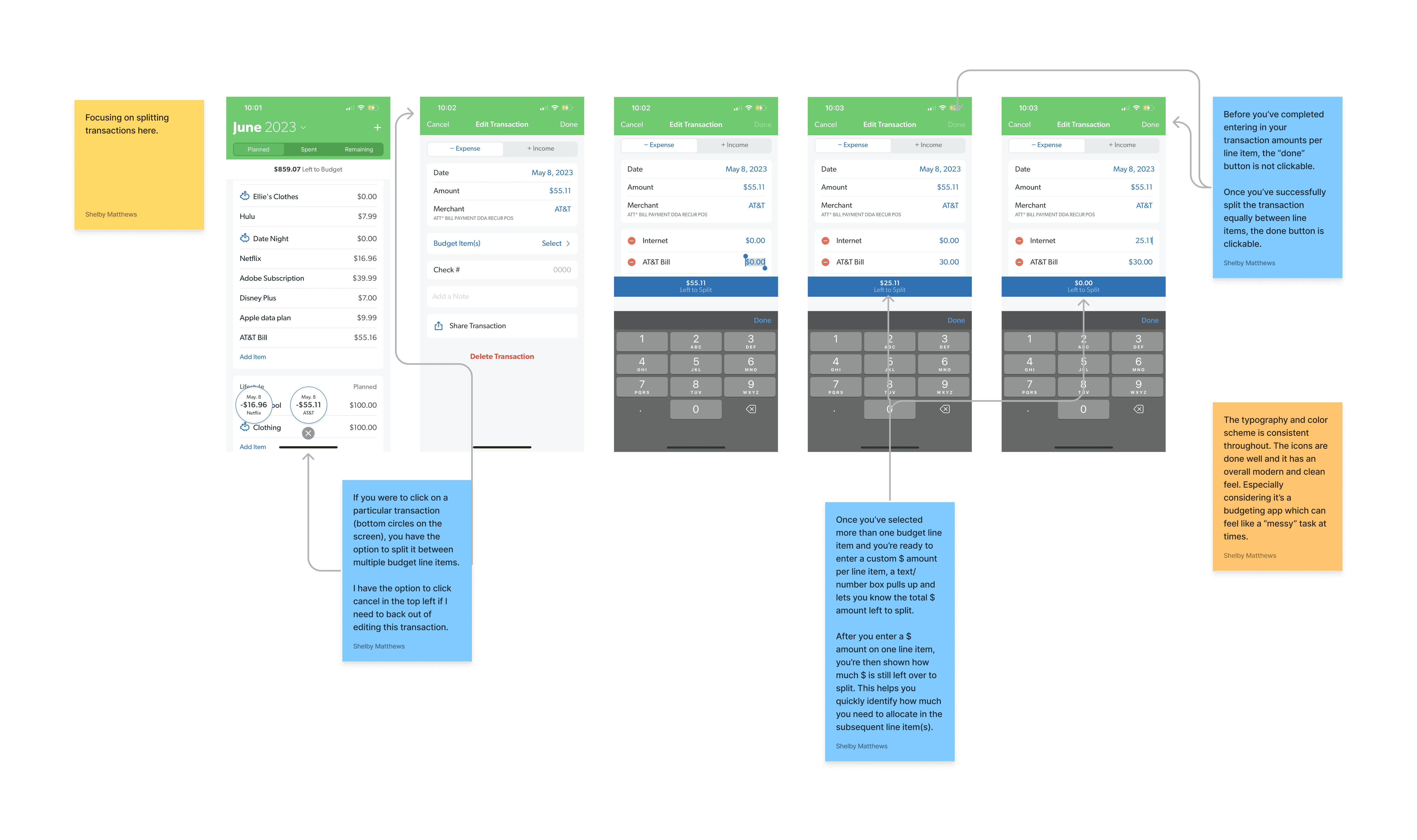
Competitor Benchmarking

To gain insights into industry patterns and UI design trends, we conducted a competitor benchmarking analysis, focusing on an indirect competitor, EveryDollar. By evaluating EveryDollar's features, functionality, and user interface, we identified valuable patterns and best practices. This benchmarking exercise played a pivotal role in shaping our solution, enabling us to incorporate proven elements that enhance the expense tracking and payment splitting experience for users.

Information Architecture

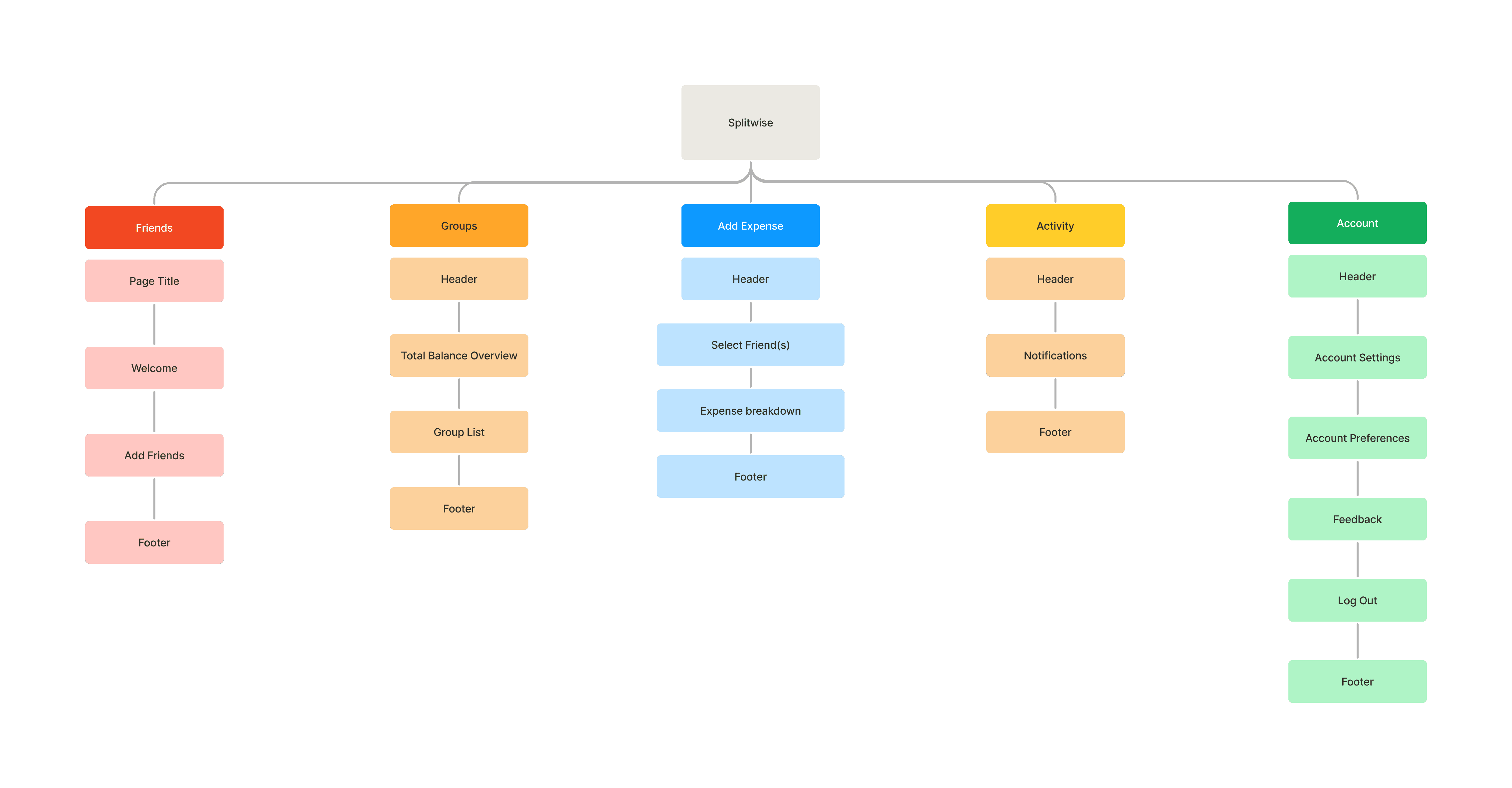
To assess the existing information architecture within the Splitwise product, we conducted an in-depth analysis to understand its hierarchy and structure. This evaluation allowed us to identify areas of improvement and areas where alterations were needed to enhance the user experience. By mapping the information architecture, we gained valuable insights that served as the foundation for our solution's redesign, ensuring a more intuitive and user-friendly expense tracking and payment splitting process for the users.

Problem Space

A primary goal for the business is to introduce categorization and improve the visual representation of who paid for what within the group experience. Currently, the lack of clear categorization hinders expense management and fosters confusion among users. By addressing these challenges and implementing intuitive categorization features, we aim to transform the user experience, fostering trust and enhancing transparency for young professionals in group living situations.

How might we simplify and streamline the expense tracking and payment splitting experience for young professionals in group living situations while introducing intuitive categorization features to enhance transparency and foster trust within the product?

Ideation

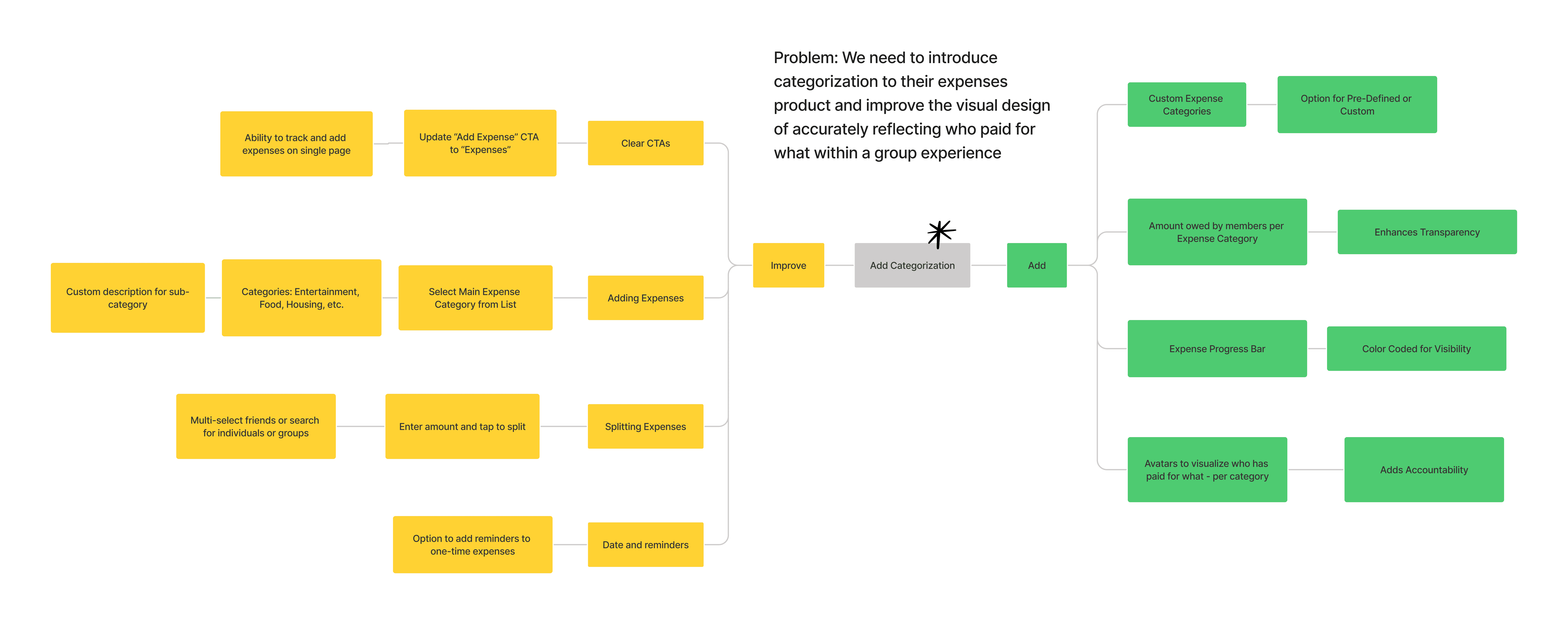
Using a mind map, we rapidly generated a diverse range of ideas to improve the Splitwise user experience. Collaborative brainstorming resulted in potential enhancements to streamline expense tracking, improve transparency, and foster trust and accountability, forming the foundation for innovative solutions in our case study.

What can we improve

The highest priority idea focused on enhancing the "Add and Split Expenses" user flow. We aimed to make the process of adding and splitting expenses within a category (either pre-defined or custom) mandatory, addressing the current optional categorization step in the Splitwise experience. This change aims to streamline the expense tracking process and improve accuracy.

What can we add

The top priority idea was to introduce the "Pre-defined and Custom Category" feature. By prioritizing pre-defined options based on qualitative survey results, users would have a more efficient and intuitive expense categorization experience, ensuring consistent and organized tracking of expenses.

User Flows

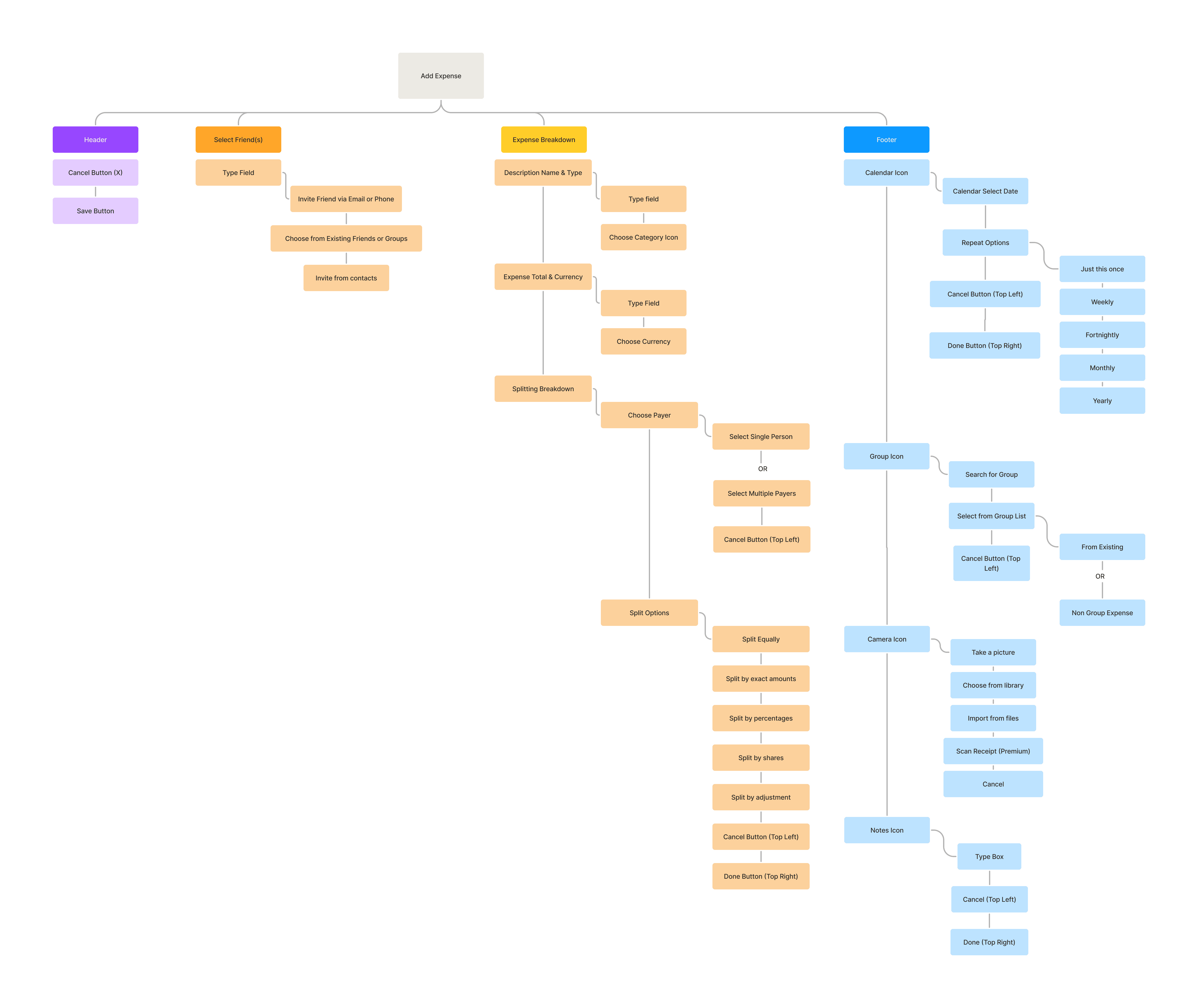
We analyzed Splitwise's 'Add and Split Expense' process, identifying pain points. With a focus on users with shared living arrangements, we proposed an improved user flow, making expense categorization mandatory for enhanced transparency, trust, and accountability. The comparison between existing and proposed flows led to potential improvements, aligning with our goal of fostering an engaging user experience.

Rapid Prototyping

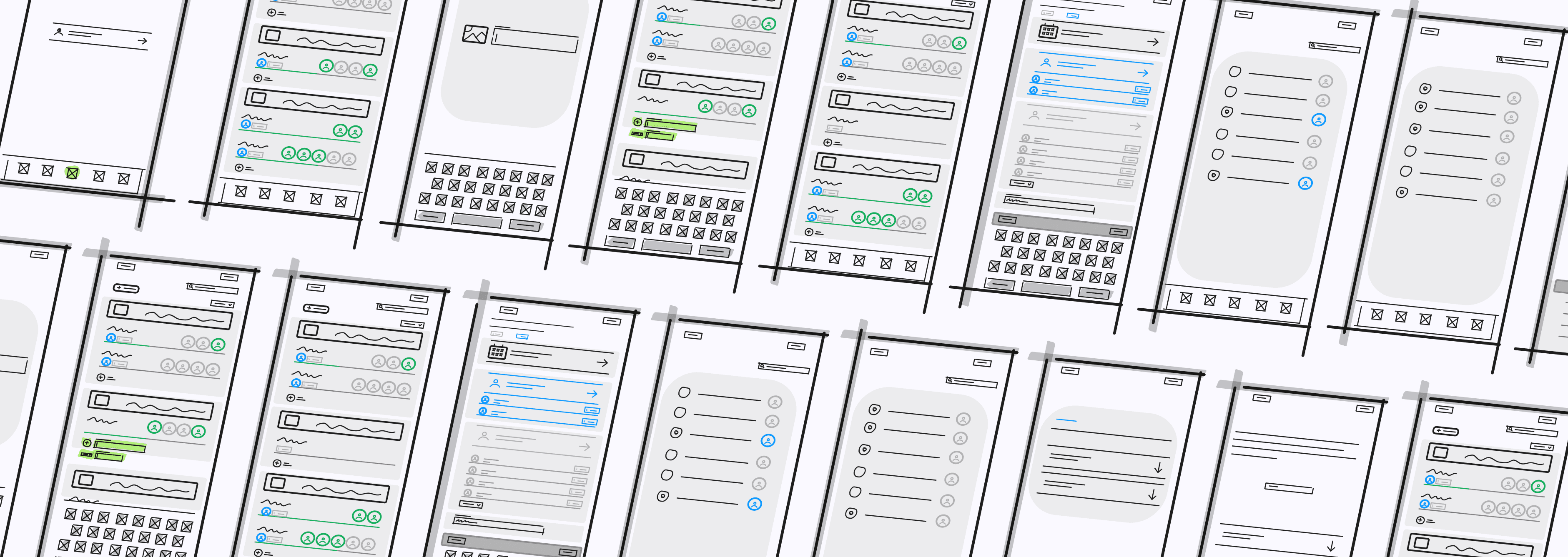
Using Figjam, we rapidly created wireframes to visualize the proposed improved user flow for the "Add and Split Expense" process. Through iterative refinement, we ensured a clear and intuitive representation of the design concept. This rapid prototyping process accelerated our case study's progression and allowed us to efficiently capture the user flow's essence.
Styles & Components

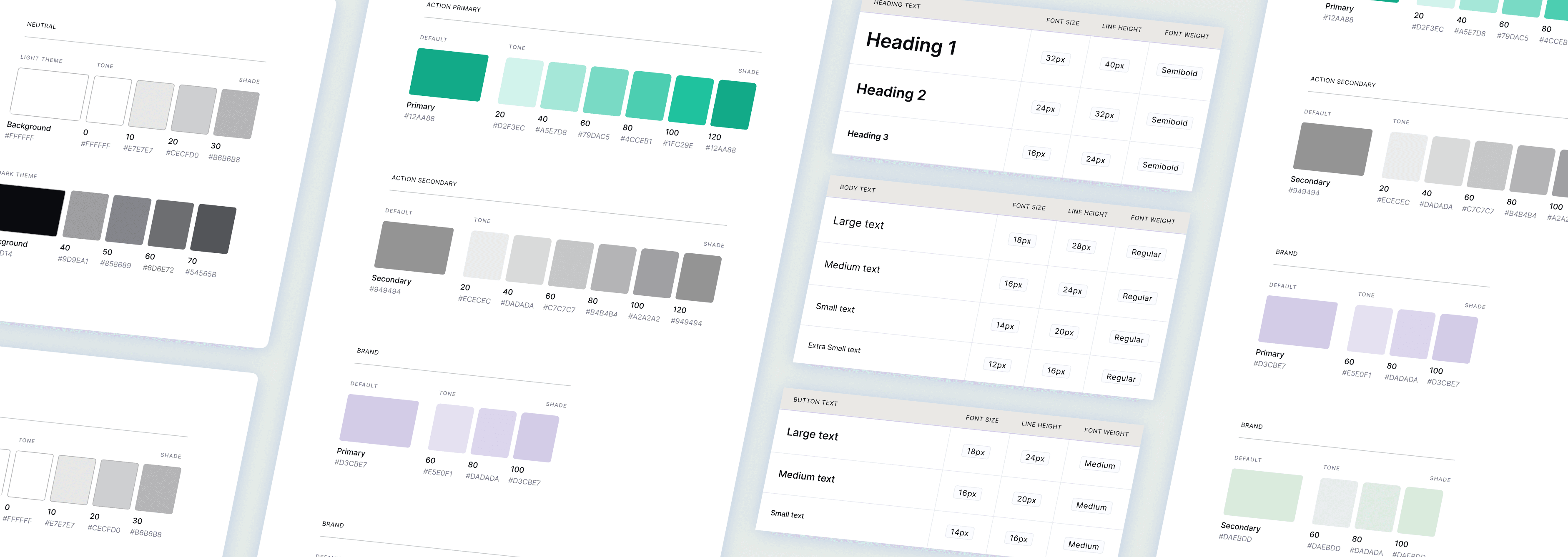
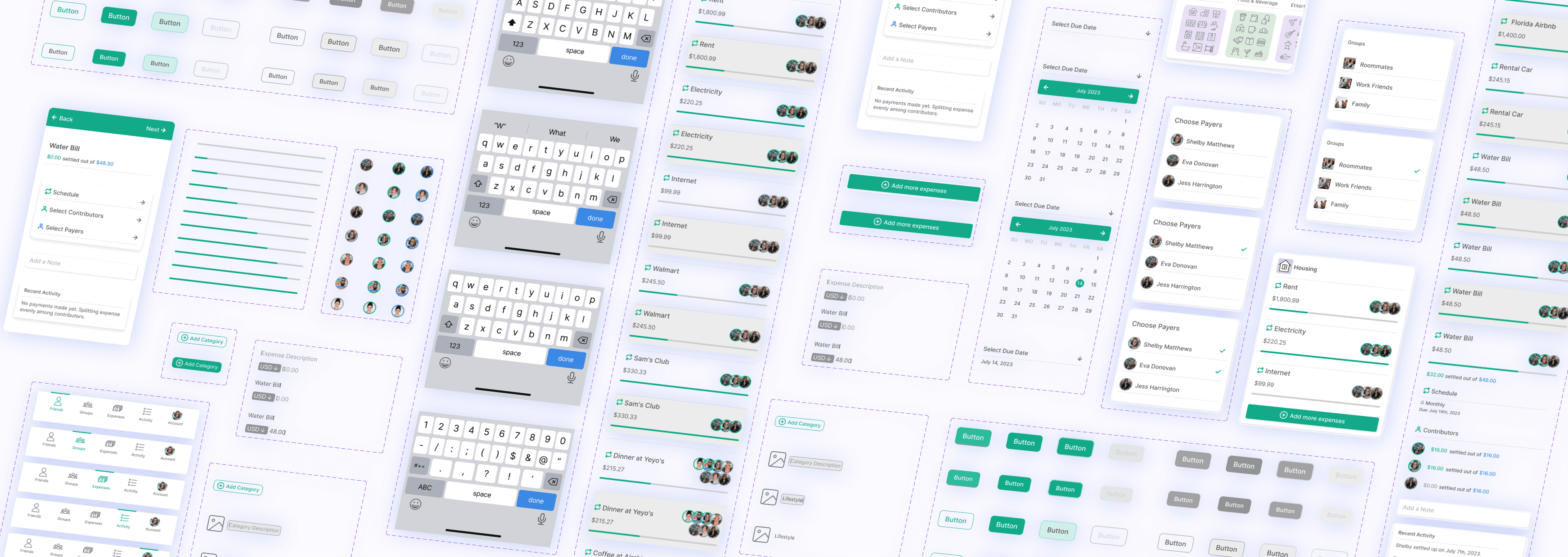
Building upon the wireframes we created in Figjam, we created color and text styles in Figma to establish a cohesive design language. These styles served as the foundation for building standardized and reusable components, streamlining the design process and ensuring a polished and consistent visual identity for the improved "Add and Split Expense" process.
High Fidelity Prototype

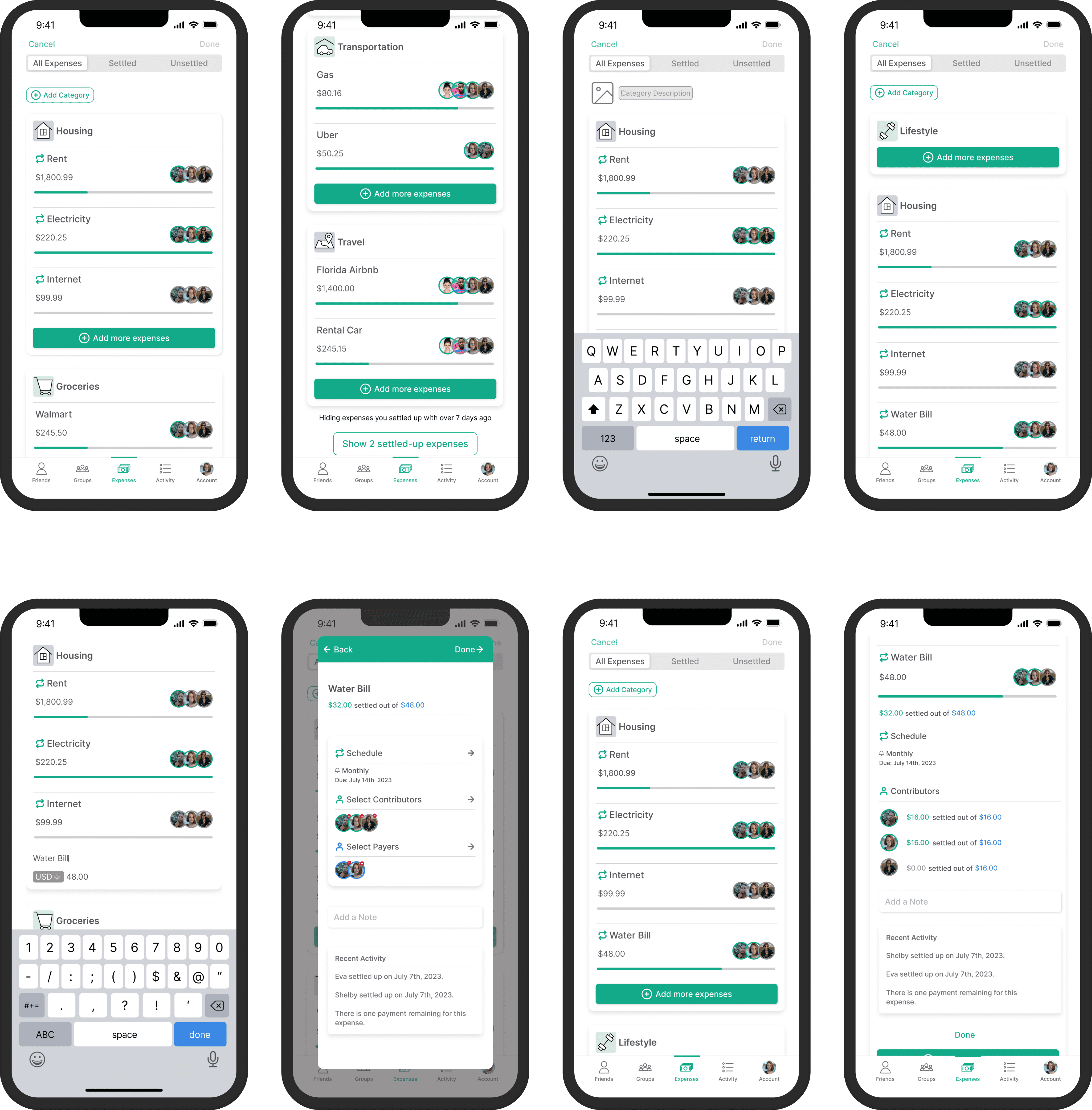
Utilizing the created components, we developed a high-fidelity prototype illustrating the enhanced "Add and Split Expense" process. With mandatory expense categorization and streamlined interactions, the prototype showcased a user-centric design, promoting transparency and trust. The high-fidelity prototype played a crucial role in visually presenting the final design and served as a foundation for further usability testing and refining the user experience in this case study.

Usability Testing

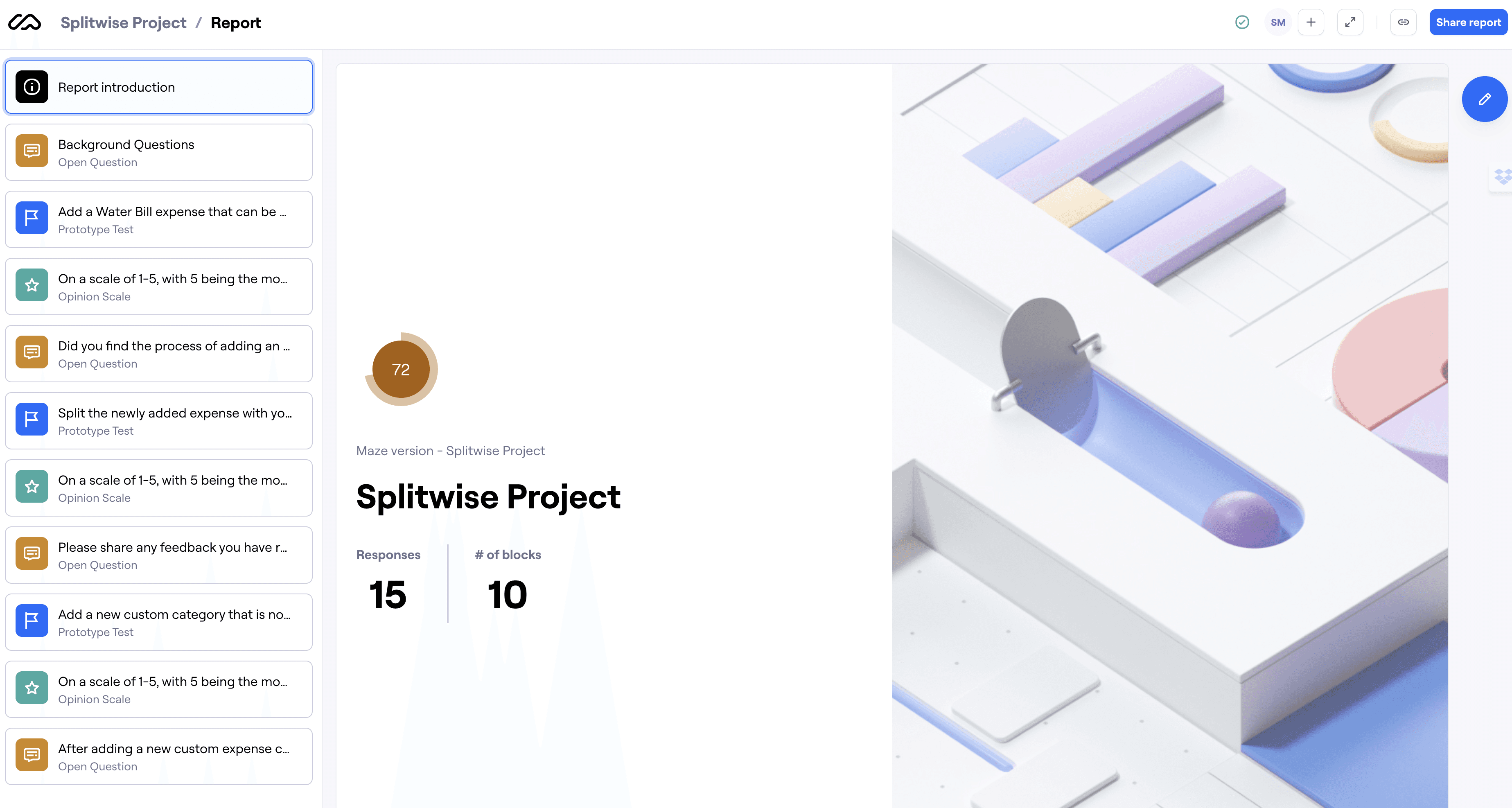
Our usability test, conducted with 15 participants using Maze, provided valuable insights despite some limitations. The feedback identified areas for further improvement in the prototype, refining the expense tracking and payment splitting experience for enhanced user satisfaction and efficiency.

Test outcomes

Having tested the prototype, we learned that improving keyboard interaction and providing clearer instructions, along with enhancing text field visibility within the prototype, would streamline the expense tracking process, resulting in a more intuitive and user-friendly product experience during future usability tests. Additionally, splitting the tasks into multiple further steps and improving element hierarchy will lead to better outcomes, accommodating user preferences and providing a more flexible flow within the prototype. The limitations of the current testing approach, with only 3 tasks, have highlighted the importance of conducting more granular and comprehensive usability tests to gain deeper insights.

Three key learnings

1. User-Centric Solutions Foster Trust and Transparency: Through qualitative research and usability testing, it became evident that introducing intuitive categorization and enhancing transparency in the expense tracking process were key elements for fostering user trust. By prioritizing the user's needs and addressing frustrations, the case study demonstrated the positive impact of user-centric solutions on overall product trust and user satisfaction.


2. Recognizing the Impact of Usability Testing Methodology: The case study emphasized the importance of considering the usability testing method's limitations and its compatibility with the prototype's complexity. While constrained to use a specific testing tool, we acknowledged the potential for further insights with alternative testing methods better suited for complex prototypes. This experience highlighted the significance of flexibility in testing approaches to uncover more targeted user pain points and refine design decisions effectively.


3. Progress over Perfection in Non-linear Design Process: The case study demonstrated that the design process is iterative and non-linear, with constant revisions leading to user-centric solutions. Embracing the idea of progress over perfection allowed for continuous improvement and ultimately resulted in an enhanced user experience for young professionals in group living situations.

Next steps

If given more time to iterate, the next steps in the case study would include implementing the key learnings from usability testing to improve the prototype. Additionally, I would conduct moderated usability testing to gain deeper insights due to the complexity of the prototype. Furthermore, I would explore creative ways to leverage existing Splitwise features, such as Splitwise Pay, to automate the syncing of transactions to the expenses page and streamline expense tracking via categorization and routing to appropriate line items. By enhancing the user experience and fostering transparency and trust, we can simplify the tracking and settlement process for users.

High Fidelity Prototype

Utilizing the created components, we developed a high-fidelity prototype illustrating the enhanced "Add and Split Expense" process. With mandatory expense categorization and streamlined interactions, the prototype showcased a user-centric design, promoting transparency and trust. The high-fidelity prototype played a crucial role in visually presenting the final design and served as a foundation for further usability testing and refining the user experience in this case study.
Test outcomes

Having tested the prototype, we learned that improving keyboard interaction and providing clearer instructions, along with enhancing text field visibility within the prototype, would streamline the expense tracking process, resulting in a more intuitive and user-friendly product experience during future usability tests. Additionally, splitting the tasks into multiple further steps and improving element hierarchy will lead to better outcomes, accommodating user preferences and providing a more flexible flow within the prototype. The limitations of the current testing approach, with only 3 tasks, have highlighted the importance of conducting more granular and comprehensive usability tests to gain deeper insights.

Three key learnings

1. User-Centric Solutions Foster Trust and Transparency: Through qualitative research and usability testing, it became evident that introducing intuitive categorization and enhancing transparency in the expense tracking process were key elements for fostering user trust. By prioritizing the user's needs and addressing frustrations, the case study demonstrated the positive impact of user-centric solutions on overall product trust and user satisfaction.


2. Recognizing the Impact of Usability Testing Methodology: The case study emphasized the importance of considering the usability testing method's limitations and its compatibility with the prototype's complexity. While constrained to use a specific testing tool, we acknowledged the potential for further insights with alternative testing methods better suited for complex prototypes. This experience highlighted the significance of flexibility in testing approaches to uncover more targeted user pain points and refine design decisions effectively.


3. Progress over Perfection in Non-linear Design Process: The case study demonstrated that the design process is iterative and non-linear, with constant revisions leading to user-centric solutions. Embracing the idea of progress over perfection allowed for continuous improvement and ultimately resulted in an enhanced user experience for young professionals in group living situations.

Next steps

If given more time to iterate, the next steps in the case study would include implementing the key learnings from usability testing to improve the prototype. Additionally, I would conduct moderated usability testing to gain deeper insights due to the complexity of the prototype. Furthermore, I would explore creative ways to leverage existing Splitwise features, such as Splitwise Pay, to automate the syncing of transactions to the expenses page and streamline expense tracking via categorization and routing to appropriate line items. By enhancing the user experience and fostering transparency and trust, we can simplify the tracking and settlement process for users.